
Agile Maps have a new look
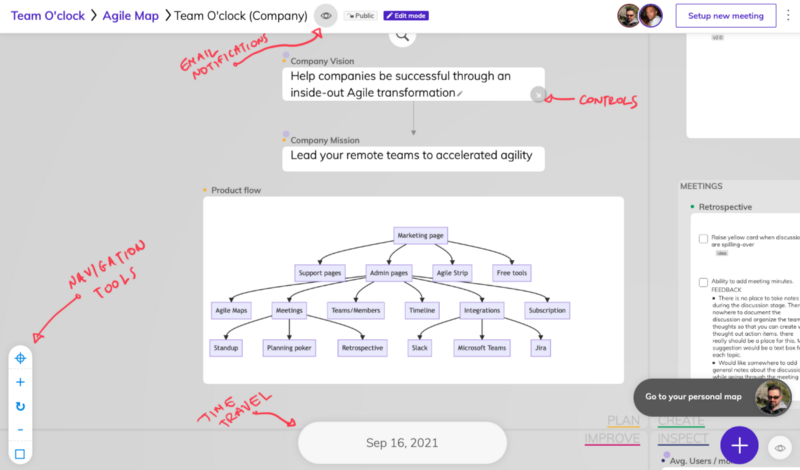
Lot’s of our customers use Team O’clock Agile Maps to visualize and monitor their agile journeys, so we decided to put some more love and improve the user experience.
Voila! Agile Maps has a new look and some important new features. Let’s go!
New widget controls
Widgets has been updated with a new look. Widget names and controls now pop outside of the box, making it easier to resize and manage the related actions, reducing clutter on the map area.
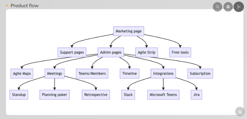
List widget revamp
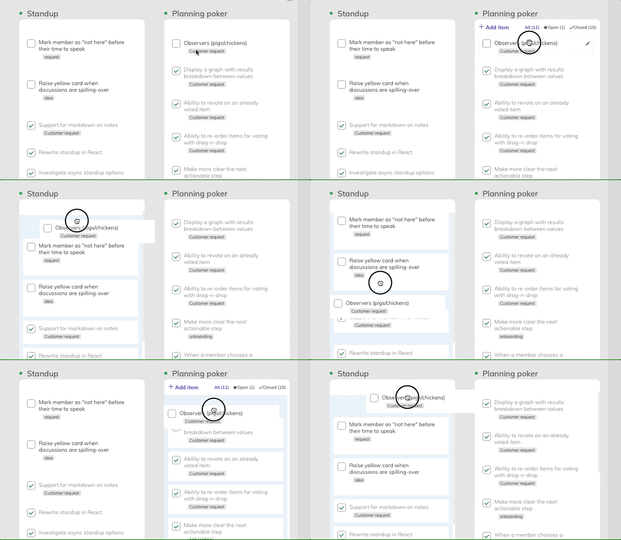
Lists are part of the most used components in Agile Maps. The list widget has been rewritten, with improved drag n’drop functionality.
Users can now move notes around, create Kanban boards and display more metadata, like the user who created the note and the date of creation.
Map import / export
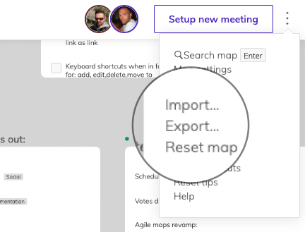
Under the three dotted menu, you will now find two additional options:
Export: where you can download the entire map in a .json file
Import: where you can import a previously exported .json file
With the import / export functionality, you can create map templates to be used around multiple teams, take the data outside Team O’clock, or move them around between different maps.
Email notifications
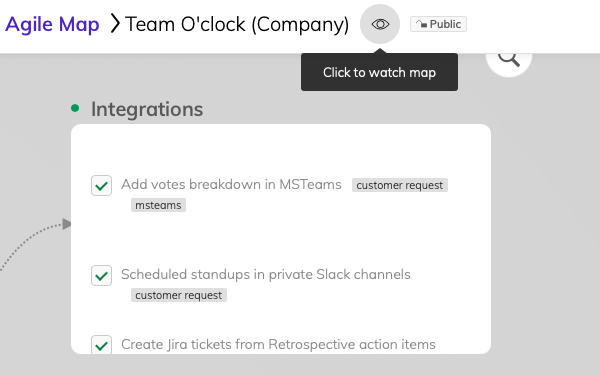
With the watch functionality, users can get email notifications when a colleague modifies a map. You no longer have to check-in and look around for changes. Stay offline and let the notifications ping you, the async way.
Live cursor
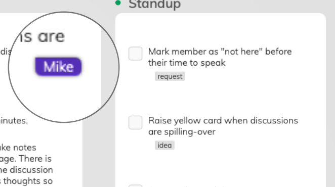
Agile Maps can be used as a whiteboard for remote teams. We’ve made it easier to collaborate with your team-mates by adding live user cursors.
When two or more people are viewing or editing an Agile Map, you can now see and follow their mouse cursor. Agile Maps, the fun way!
We hope you enjoy the latest Agile Maps changes. Not in Team O’clock yet? You can always view a sample here (no account required), or join for a free trial.


